Showing posts with label Android PhonesApple PhonesBlackberry PhonesWindows PhoneHeadsetsPhone casesPhone accessories. Show all posts

Wednesday, November 6, 2013

Apple iPhone 5s Case review: Slim, attractive case is a safe bet

When it comes to iPhone cases, Apple has always seemed to accept the accessories only grudgingly, as if the mere idea of covering its beautiful designs—in plastic, leather, or whatever—was distasteful. The company has long sold third-party cases in its stores, but I suspect this is simply because customers demand them. Apple would prefer for everyone to leave their phones proudly naked.
Indeed, the only iPhone case the company itself has previously made, the iPhone 4 Bumper, could scarcely be called a case: It simply surrounded the edges of the phone. The Bumper was nicely designed (if a bit bulky for what it was), and it alleviated the “bridged-antenna” issue on the iPhone 4, but it left the entire back and front of the iPhone 4 exposed. (Apple would probably say “made available for admiration.”)
So we were a bit surprised when Apple announced, alongside the iPhone 5s and 5c, that it had created cases for both new phones. I’ve been testing the new $39iPhone 5s Case, and it’s quite good for a protective shell. (If you've got an iPhone 5c, there's a separate iPhone 5c Case.)
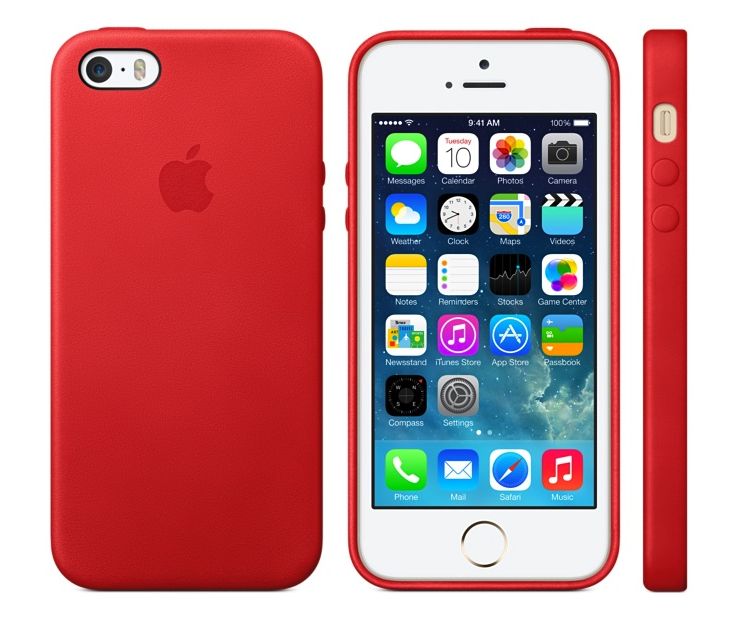
The case—which actually fits both the iPhone 5s and the iPhone 5—is a rigid shell that covers the back and sides of your iPhone, leaving its screen exposed. Available in brown, beige, black, yellow, light blue, and (Product) Red, the case sports a soft-leather exterior with a recessed Apple logo on the back. The inside rear of the case—but not the inner edges—is covered in a soft microfiber. I tested the beige version.
(As an aside, if you see the beige version in its package—for example, at your local Apple Store—it may appear to be a bit pinkish, thanks to pale-pink packaging. Rest assured that once you unpack the case, you’ll see that it really is a light beige. It’s a really odd packaging choice by Apple.)
Like many shell-style cases, the iPhone 5s case is thin and light, but most shells are made of thin plastic, not leather. Apple’s offering weighs just 13 grams (less than half an ounce), and it adds only about 4mm to the width and height of the iPhone 5s or 5—even less to its thickness. Your phone definitely feels bigger with the case on, but not at all bulky or heavy.
The case leaves a tiny bit of the phone’s metal edge visible from the front, rather than hiding it the way many shell-style cases do—a nice aesthetic touch. The iPhone 5s Case also extends a bit past the screen in front, forming a lip that protects the screen when you place the phone face-down. But because the edges of the case don’t actually wrap around the front, this lip doesn’t interfere with touches, drags, and swipes near the edges of the screen. Overall, the case doesn’t offer substantial padding, but it should handle most reasonable bumps and drops (direct impacts to the screen excepted, of course).
iPhone 5s Case buttons
The iPhone 5 Case's button overlays and Ring/Silent-switch opening
The case covers the iPhone’s Sleep/Wake button and volume buttons with custom-molded overlays. These overlays are subtle, but they’re prominent enough to locate by feel. They’re also easy to use, requiring barely more force than the bare buttons themselves. The Ring/Silent switch, on the other hand, is accessed through a hole in the case. Unfortunately, the switch is recessed enough, and the hole is small enough, that the only way I could flip the switch was by using a fingernail. On the back, the case provides an opening for the phone’s camera and flash. Regardless of the case color, the plastic ring surrounding this opening is black.
Along the bottom edge of the case are openings for the phone’s headphone jack and Lightning-connector port, along with perforations for the microphone and speakers. The headphone-jack hole is small enough that only small headphone plugs will fit. Larger plugs, like those on some third-party headphones, will need an adapter of some sort. (Luckily, many headphone vendors have moved to smaller plugs because of the popularity of phone cases.) Similarly, the Lightning-connector-port opening is quite small, so larger third-party plugs may not fit, and you won’t be able to use an encased iPhone with most third-party dock cradles and dock speakers. (Because the case is so form-fitting, it’s not easy to quickly pop your iPhone out of the case to use the phone with a dock cradle or other accessory. It’s not difficult to remove the case, but it takes a bit of finagling.)
iPhone 5s case bottom
The bottom edge of the iPhone 5s case
The leather’s texture is matte rather than glossy-smooth, and it adds a bit of grip to the phone without making it difficult to remove from your pocket. It also looks quite nice, and unlike with many leather cases I’ve tested over the years, the leather doesn’t scratch if you look at it wrong. I scraped my beige case with my fingernail, a key, and a letter opener, and if I look closely, with light shining on the case just right, I can see some minor scuffs, but the blemishes are largely unnoticeable. (I suspect such scuffs will be more visible on the darker versions of the case, and especially black, but I haven’t tested this.)
On the other hand, the case will show some abuse if you drop it onto a rough, hard surface, as this YouTube video shows.
I do have two long-term questions about the case’s durability. First, given the material, will repeatedly removing the case and putting it back on cause the case to stretch and lose its precise fit? Second, how well will the leather hold up to normal wear and tear? I obviously can’t answer these questions yet, but asMacworld staffers use our cases over the coming weeks and months, we’ll keep an eye out for any issues. If we see any, we’ll update this review with our findings.

Bottom line

Apple’s iPhone 5s Case offers decent protection in a minimalist design, it fits perfectly, and it feels and looks quite nice. At $39, it’s also reasonably priced compared to other leather cases I’ve tested, which often sell for $50, $60, or more. All of which is to say that while we’ll soon see a flood of third-party cases for the iPhone 5s, some of which may look nicer or have better features, you won’t regret buying Apple’s case right out of the gate. Which is a good thing, considering that this is one of the cases iPhone 5s buyers will see in every Apple Store—and, at least initially, it may be the only option they see.
Updated 9/24/13, 10:45am, to add a photo of the bottom edge of the case.

At a Glance

Apple’s iPhone 5s Case offers decent protection in a minimalist design, it fits perfectly, and it feels and looks nice. And at $39, it’s reasonably priced as leather cases go.
Price when rated:$39.00
 COMPARE

Android 4.2 is a better flavor of Jelly Bean

Google's Android 4.2 update may not be the rumored full-blown Key Lime Pie update we've been expecting, but it does add some much needed features and improvements to the Android operating system. This new version of Android keeps the Jelly Bean moniker, and doesn't look all that different from the first version of Jelly Bean launched over the summer. Android 4.2 officially lands on November 13, along with the Nexus 4 phone, Nexus 10 tablet, and revamped Nexus 7 tablets. Other devices—especially Nexus models—may get the upgrade, but neither Google nor hardware makers have said anything about their rollout plans.
On both phone and tablet, Android 4.2 looks and feels more polished than the previous version, and it cleans up some niggling issues we've seen. It also provides an all-new interface for the camera, introduces an additional way to type using the native keyboard, and helps to better unify the Android experience across phones and tablets. Here are just a few of its new features.

An improved camera

The new radial menu in the camera app.
The native Android camera app receives a complete interface overhaul in version 4.2. The clean interface is heavily streamlined; it hides most of the camera's options and menus from the main screen. This approach makes it easier to focus on capturing photos or videos, but adds a little complexity for some important features you might need to access on the fly. For example, I wasn't a fan of having to perform extra taps in order to toggle on/off basic settings like the camera flash.
A sample photo sphere photo.
Aside from the new look, the biggest addition to the camera app is the Photo Sphere shooting mode. Photo Sphere lets you take photos of your surroundings, much like Microsoft's Photosynth; the app will then stitch together the images into a 360 degree panoramic photo. In her Nexus 10 review, Senior Editor Melissa J. Perenson mentions that she had some trouble getting the app to accurately stitch her photos together. When I tried out Photo Sphere on the Nexus 4 I didn't encounter any problems, though I did notice errors in my panoramas whenever I moved the phone around too quickly. It's a neat feature, but your results will vary.

A new way to type

Google has added gesture typing to the stock keyboard in Android 4.2. Gesture typing is not new; this is the core of Swype's app. Now, instead of poking at the screen in order to eke out words, you can simply glide your finger over letters and the keyboard will offer predictions of what it thinks you're trying to write. As someone who isn't a huge fan of gesture-based keyboards (Swype's in particular seems to hate me), I was pleased with Google's implementation. The keyboard accurately predicted 90 percent of the words I was trying to spell, but it did have some problems recognizing when I wanted to spell words such as "success" or "buttress."
Gesture typing on the Nexus 10.
The gesture typing also works on tablet versions of Android 4.2, and I took special joy in sliding my fingers all over the Nexus 10's 10.1-inch screen. The extra real estate made it easier to accurately slide from letter to letter, resulting in fewer misspelled words. I'm still not entirely sold on gesture keyboards, but Google's offering goes a long way in convincing me that they can be useful.

Google Now learns even more tricks

Google Now may not be exclusive to Android 4.2, but the service's new functions are enough to make iOS and Windows Phone 8 users green with envy. Google Now presents you with "cards"—pieces of information it thinks are relevant to you based on the time of day, your location, and your search history. The service now lets you track things like packages, flights, hotel and restaurant reservations, as well as events in your general area. Google Now has also added alerts for breaking news events, letting you know if a news story has been written about a particular topic you care about.
The service has matured considerably since its initial introduction, but I still feel like there's more Google could be doing with the service. Most of the Google Now cards have only one or two basic options, and Google would benefit from integration with third-party apps. Google Now is still extremely useful—on phones more so than on tablets, perhaps—but the service still has a way to go before it stops feeling like it's in beta.

Consistent user experience

Android 4.2 on the Nexus 10.
One of iOS's biggest strengths is its consistent user experience: What you get on an iPhone or iPod touch is, for the most part, what you'd get on an iPad or iPad mini. On Android, this was never the case. Putting aside the countless modifications made by carriers and manufacturers, Android on phones is a different world compared to Android on tablets.
Android 4.2 changes all of that. Android phones and tablets now share a similar user interface that—in many ways—looks like the phone version of Android blown up to fit a larger screen. The virtual navigation buttons on tablets have been moved to the bottom center of the display, making them more difficult to reach on larger tablets, especially if you are holding the device with two hands. And a dock now runs near the bottom of the screen where you can pin apps that you frequently use.
The new settings panel.
On large tablets like the Nexus 10, notifications and the settings panel are split up and placed in drop-down shaders on the top left and right corners of the screen, respectively. The notification bar on phones and smaller tablets (like the Nexus 7) is largely the same as it was before, though now you can use a two- finger gesture to gain quick access to toggles for the device's data, Wi-Fi, Bluetooth, and brightness, among other settings. This gesture shortcut is perhaps the most welcome interface tweak brought by Android 4.2, since it saves you from having to dig through multiple menus in order to do simple tasks like adjust screen brightness.

Still in development

Unfortunately the version of Android 4.2 on our Nexus 4 and Nexus 10 review units is not the final build. Other features will be added in an update still to come November 13, which is when Google's latest devices go on sale. That's when 4.2 will get already announced features such as the ability to pin apps to the lock screen and to add multiple user accounts on tablets. We'll update this review at that time and make note of any additional improvements we discover once the update goes live.

Bottom line

Android 4.2 Jelly Bean brings with it some interesting features, but ultimately doesn't feel all that different from Android 4.1 on phones. The improvements to the camera interface, keyboard, and Google Now are certainly welcome, but Google seems to have overlooked several aspects of the operating system that are in dire need of an upgrade. Navigation through the OS is still inconsistent from one menu to another, some system apps (like the News and Weather app) haven't been updated since Android 2.2, and many of Android's settings are overly cryptic or redundant.
In many ways, this update is more important for Android tablets than it is for Android phones. By tweaking the Android interface so that it looks similar across both tablets and phones, Google takes much-needed steps toward unifying the Android experience across devices. Whether that translates to developers making more tablet-optimized apps remains to be seen, but in the end this approach can only be better for users going from one device to the other. Android still needs more polish, but with this update, Android 4.2 clearly has what it takes to compete head on with the likes of iOS 6 and Windows Phone 8.

At a Glance

Android 4.2 is an improvement over the original Android Jelly Bean, with interface tweaks that make the OS look the same on both phones and tablets.
Price when rated:Free

Pros

  • System settings are easier to reach
  • Gesture keyboard works really well

Cons

  • Some apps didn't get updated
  • Navigation isn't consistant throughout the OS
 COMPARE

Apple introduces new Retina iPad mini

At its October 22 media event, Apple announced a new iPad mini with Retina display, as well as lower prices for the original iPad mini, giving its smaller tablet much-anticipated upgrades to its screen, processor, cameras, and more.

New iPad mini with Retina display

For starters—and as we had hoped and expected—the new iPad mini with Retina display ups the screen resolution to Retina quality, going from 1024 by 768 pixels to 2048 by 1536 pixels at the same 7.9-inch (diagonal) screen size. This change raises the iPad mini’s pixel density from 163 pixels per inch to 326 pixels per inch—a density almost identical to that of the iPhone 5s.
The new mini gets some upgrades on the inside, as well. Whereas the original mini used the same dual-core A5 processor, at the same clock speed, as the two-and-a-half-year-old iPad 2, the new mini line bumps its horsepower significantly by using Apple’s 64-bit A7 processor, similar to the one in the iPhone 5s. During Tuesday’s media event, Apple senior vice president of worldwide marketing Phil Schiller said that the new processor makes the Retina iPad mini up to four times as fast as its predecessor for processor-intensive tasks, and up to eight times faster for graphics-intensive tasks. Like the new full-size iPad, the iPad mini with Retina display also features Apple’s M7 motion coprocessor, which can monitor the device’s various motion sensors (accelerometer, compass, and gyroscope) without having to wake the main processor.
The new mini also gains upgraded wireless capabilities thanks to dual Wi-Fi antennas and support for MIMO (multiple input, multiple output) technology. Apple says this change allows the new iPad mini to communicate at up to twice the bandwidth: 300 Mbps (megabits per second). The cellular-equipped versions of the new iPad mini also include expanded LTE capabilities, allowing them to work on more LTE networks around the world.
Apple has also upgraded the iPad mini’s cameras slightly. Though the resolution of those cameras hasn’t changed (5 megapixels for the rear camera, 1.2 megapixels for the front FaceTime HD camera), the company says the new iPad mini gains larger pixels and improved backside illumination sensors in order to take better low-light photos. In addition, the improved image-signal processing of the A7 processor should provide better overall camera performance.
(It’s not yet clear how much RAM the new mini gets. Apple never publishes this particular spec, so we’ll have to wait for the inevitable iPad mini teardowns. iFixit’s teardown of the original iPad mini revealed 512MB of RAM.)
Apple says the new iPad mini with Retina display offers the same 10-hour battery life as the original iPad mini. However, it appears that accomplishing this feat while adding the additional power drain of a Retina display required Apple to increase—ever so slightly—the size and weight of the new iPad mini. The new version is exactly the same height (200mm) and width (134.7mm) as the original, but it’s a tiny bit thicker (7.5mm compared to 7.2mm) and a little bit heavier: 331 grams versus 308 grams for the Wi-Fi model, and 341 grams versus 312 grams for the Wi-Fi + Cellular version.
The iPad mini with Retina display will be available in silver/white or Space Gray/black “later in November,” according to Apple. The Wi-Fi versions will cost $399 for 16GB, $499 for 32GB, $599 for 64GB, and $699 for 128GB—a first in that capacity for the iPad mini. Cellular versions add $130 to each: $529, $629, $729, and $829, respectively.
By all accounts, the original iPad mini has been a big hit for Apple, even though other small tablets, such as the latest Nexus 7, have debuted with better specs or lower prices. The new iPad mini line should blunt some of that spec-sheet-based criticism.

Original iPad sticks around

While Apple is introducing a brand-new iPad mini line, the company is keeping the original iPad mini around—in a single configuration—as a lower-price option. Specifically, the 16GB Wi-Fi iPad mini is now priced at $299, rather than its original price of $329, with the Wi-Fi + Cellular version at $429. The cellular version is available for the U.S. networks of AT&T, Sprint, T-Mobile, and Verizon.
Apple did make one minor change to the original iPad mini: It’s now available in Space Gray or Silver, rather than the original black or white. It is available now.
Both iPad mini versions (Retina and non-Retina) ship with iOS 7 installed, and—as with all devices running iOS 7—allow you to download Apple’s iLife and iWork suites for iOS free of charge.

New iPad mini cases

Finally, Apple announced new cases for its new Retina iPad mini. The new iPad mini Smart Cover, made of polyurethane, will sell for $39. A new leather iPad Smart Case will cost $69.
Updated 11/4/13, 4pm, to correct Wi-Fi speed.

iPhone 5 takes next step in smartphone evolution

It's been a little more than five years since Apple released the original iPhone. During that time the world has changed. People now expect fast, reliable Internet connections and bright touchscreens on devices they can fit in their pockets.
In the meantime, the iPhone has remained recognizably the iPhone. Each successive generation has added welcome features, but none have strayed so far from the previous one as to be unrecognizable. Indeed, from the very first iPhone upgrade, Apple has been taken to task by critics for following that initial exciting burst of revolution with years of steady evolution. (Meanwhile, the iPhone has become wildly successful, proving that phone buyers are excited by the product even if the pundits aren't.)
Now here's the iPhone 5, and is it any surprise that this model doesn't reimagine the iPhone in a completely new way? No, it too is recognizably an iPhone, an evolution of previous models—yet it offers major advances on almost every front. In the technology industry's fastest-moving product category, it's the very best version of the most successful product produced by the world's most valuable company. If the iPhone 5 bores you, you are deficient in joie de vivre.

Improving on the unimprovable

Almost every new Apple product is thinner, faster, and lighter than its predecessor. But I've wondered how much further down that path Apple could go with the iPhone without rewriting the laws of physics. Given that the iPhone 4S was just 9.3 millimeters thick and weighed a meager 140 grams, I had assumed that any changes in future iPhone dimensions would be perceptible only on spec sheets, but not by regular people.
Turns out I was completely wrong.
In photos, a silver-and-white iPhone 5 looks not much different from the white iPhone 4 or 4S. But photos don't do justice to how thin it feels when you pick it up; the thinness is palpable, not theoretical. Thanks to major materials upgrades (including thinner glass and the elimination of a layer of touch sensors), the iPhone 5 is about 80 percent as thick as its predecessor.
Even more impressive is the weight. As one observer pointed out to me on Twitter, the iPhone 4S was as dense as a slab of Pyrex glass. At just 112 grams, the iPhone 5 doesn't have that same density. It feels almost like a movie prop when you pick it up for the first time, as if behind that glass screen there's foam rather than circuitry.
To make room for its taller display, the iPhone 5 is nearly nine millimeters taller than the iPhone 4 and 4S. (It creates an optical illusion: Several people have told me the phone seems less wide than older models, but it's not. And, of course, black is slimming.) Yet the iPhone 5 is so thin that its overall volume is 12 percent less than that of the iPhone 4 or 4S and a third less than the original iPhone.
And yet for all of this reduction in weight and thickness, the iPhone still feels solid, not cheap; it's all metal and glass. Apple likens it to a fine watch, though to me it feels more like a Braun razor crossed with the Monolith from "2001." (My God, it's full of apps!)

Darth Vader's phone

ROBERT CARDIN
The black iPhone 5 (left) and iPhone 4S (right).
In overall design philosophy, the iPhone 5 is a clear descendant of the iPhone 4, rather than a clean break. It's still got a flat front and back, a raised metal ring around its sides, and those signature rounded edges. The most notable change is the replacement of the all-glass back of the iPhone 4 and 4S. On the iPhone 5, the bulk of the back is made from the same aluminum material as its sides; there are still small glass panels top and bottom.
The metal ring itself is now beveled (okay, chamfered), which makes the phone feel more comfortable in your hand. It also gives the front face of the white-and-silver model a silver halo that reminds me of the original iPhone.
In the past, iPhone color choices have been pretty limited. The iPhone 3G came with either a black or a white back, but that was it. The iPhone 4 came in black and (eventually) white, front and back, but the metal ring was the same regardless of color choice. The white iPhone 5 does closely resemble the iPhone 4/4S, with its white glass and silver metal.
But the black iPhone 5 model is completely different. It's like the Spinal Tap iPhone. (How much more black could it be? None more black.) The front and back have black glass, yes, but the metal band and metal strip on the back are both what Apple calls "slate"—a metallic matte black. The switches are black. The Apple logo on the back is black. Even the box it comes in is black, with "iPhone 5" printed in shiny black lettering. If the white-and-silver iPhone 5 is Gandalf'siPhone, the black-and-slate model is Darth Vader's.
When I had only spent time with the white iPhone 5, I felt less excited about the iPhone 5's design. It was thinner and lighter, yes, but it didn't look much different from the white iPhone 4S I've used for the past year. The black model completely changed my opinion. It's gorgeous. Not everyone will want to embrace the Dark Side, but the black metal and black glass really tie the design of the phone together in a way that the white-and-silver tone doesn't.

Movies and apps trade letterboxes

Before the iPhone 5, all iPhone models had a 3.5-inch display with a 3:2 aspect ratio. The iPhone 5 breaks that mold, slightly: its display is just as wide as previous models (640 pixels on a Retina display), but is now 176 pixels taller. The result is a 16:9 aspect ratio—the same shape as an HDTV.
Beyond increasing the phone's height and adding roughly 113,000 pixels, this change allows every page of the home screen to fit an extra row of icons, so you can stick four more apps in places you couldn't stick them before. App folders are similarly expanded. Widescreen movies and TV shows fill the screen instead of displaying letterboxed (or with their sides cut off). When you shoot video with the iPhone 5 camera, you can see the entire frame of what you're shooting without double-tapping to zoom out as on previous models.
Now see everything you're shooting when you shoot widescreen video.
Apps, on the other hand, display with black bars around them unless they've been updated to take advantage of the iPhone 5 screen's height. In practice, this isn't a big deal—the black bars are so black as to basically disappear into the rest of the display, especially on the black model. It does mean that the onscreen keyboard is shifted up from where it usually is, which requires a minor adjustment.
Weather uses the added height to add an hourly view.
Apps that have been updated to support the taller screen appear to have taken one of two approaches. Some just show you more of what you had before: more emails, more tweets, taller webpages. That makes sense for apps that are essentially just lists of things. But other apps can use the greater space to add information that wasn't visible before. Apple's Weather app, for example, now displays an hourly forecast that's only available on older iPhones after you tap on the current day. The iPhone 5 is hardly an iPad, but there's enough extra room on its screen for some iPhone apps to spread their wings in a way they couldn't do before.
Size aside, the iPhone 5's display does appear to be an improvement on the one in the 4 and 4S. Colors appear more saturated and blacks seem blacker. It's not a major improvement, but it does look better.

Lightning strikes

The old dock connector and the new Lightning connector.
JASON SNELL
For people with a large hardware investment in Apple's iOS ecosystem—connecting cables, speaker docks, car chargers and the like—the iPhone 5 signifies a major transition. This device marks the beginning of Apple's replacement of the nine-year-old 30-pin dock connector with the new Lightning connector.
While Lightning-to-30-pin adapters will be available, this will almost inevitably mark the death knell for many older accessories. When Apple dropped FireWire support from the dock connector a few years back (a midstream change that many people seem to have forgotten), several of my chargers and a speaker system just stopped working. I bought a FireWire-to-USB adapter, but never really used it because it didn't fit well and using it was awkward. Lesson learned. This time I'm going to be wary of buying adapters to patch up old systems. I think I'll save my money and buy new accessories when I need them, rather than trying to stave off obsolescence with a series of ugly, ill-fitting adapter hacks.
Still, any transition like this is bound to be frustrating. I've got dock-connector cables all over my house and office. The iPhone 5 comes with a single cable, meaning that if I want to charge my phone at home or at work, I need to carry my cable with me (or buy a spare for $19). In time this will all work out and Lightning USB cables will be as common as ninjas in 1980s comics. But in the meantime, we'll be paying for adapters and cables and grousing all the way.
So why did Apple replace the venerable dock connector with Lightning? There are plenty of reasons, starting with size—the new connector is shockingly smaller than the old one. It's smarter than USB. It's also better, because there's no wrong way to insert the cable into the device—either way will do. And presumably it's been designed to last Apple for the next nine years, give or take, so that we won't have to make this unpleasant transition again in a year or two. (Fingers crossed.)